Celebrate Summer
A Brochure Concept for OLAPLEX
Role: Concept • Art Direction • Visual Design
Independently conceived and executed.
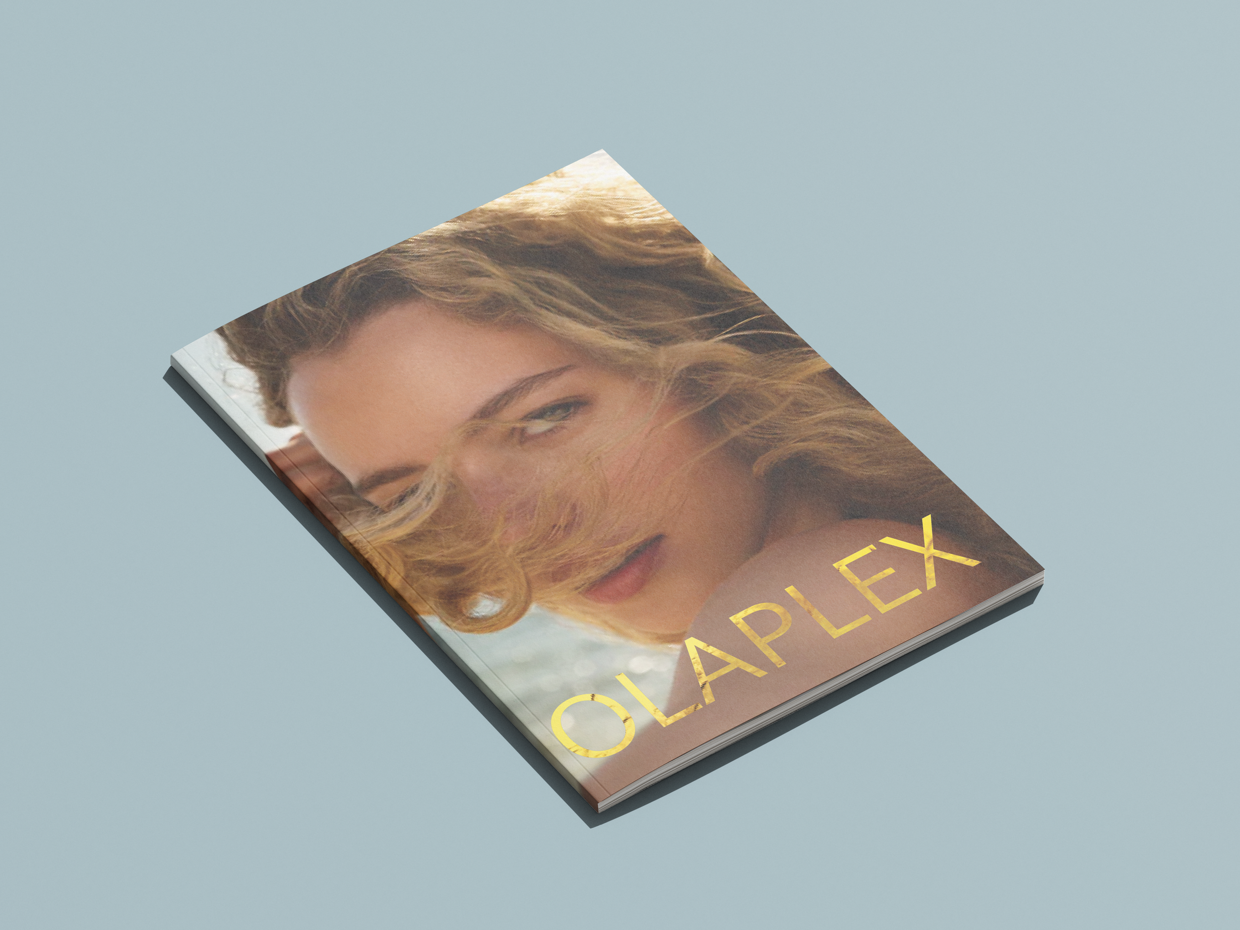
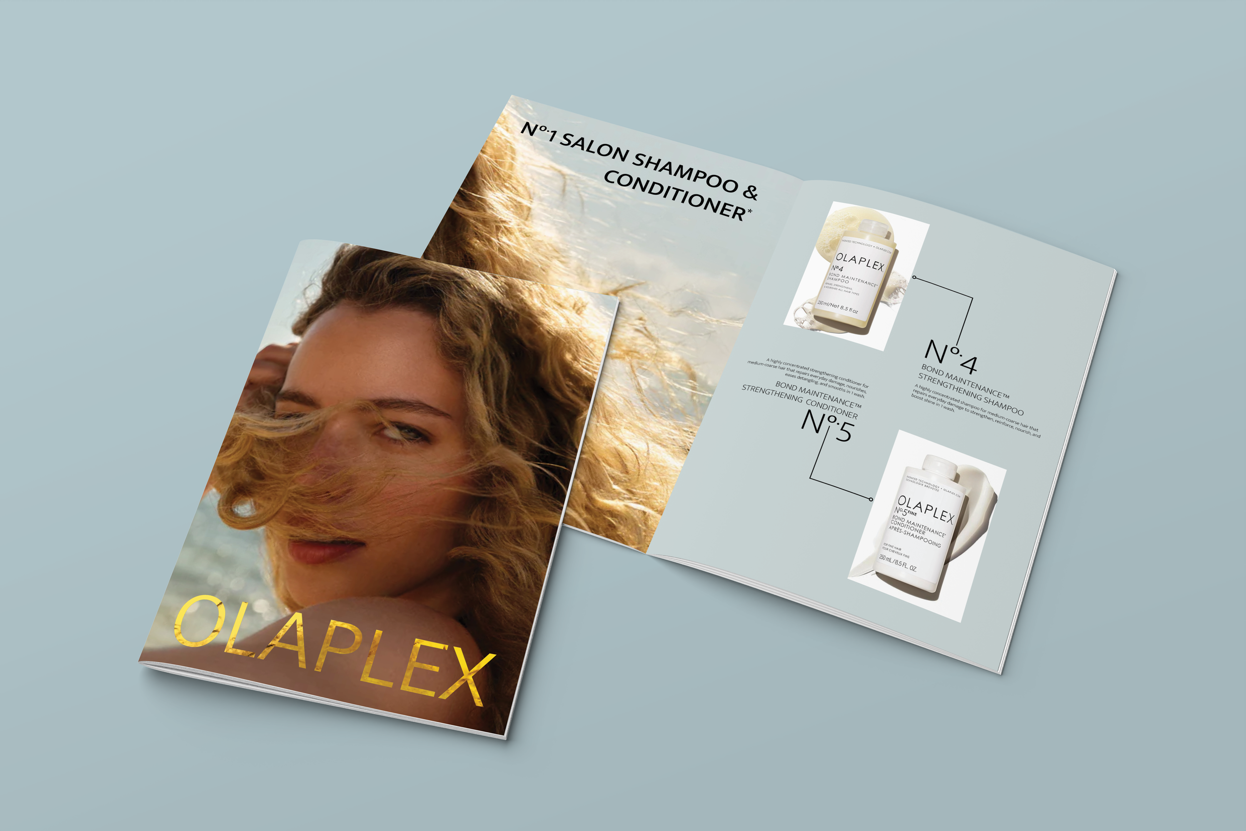
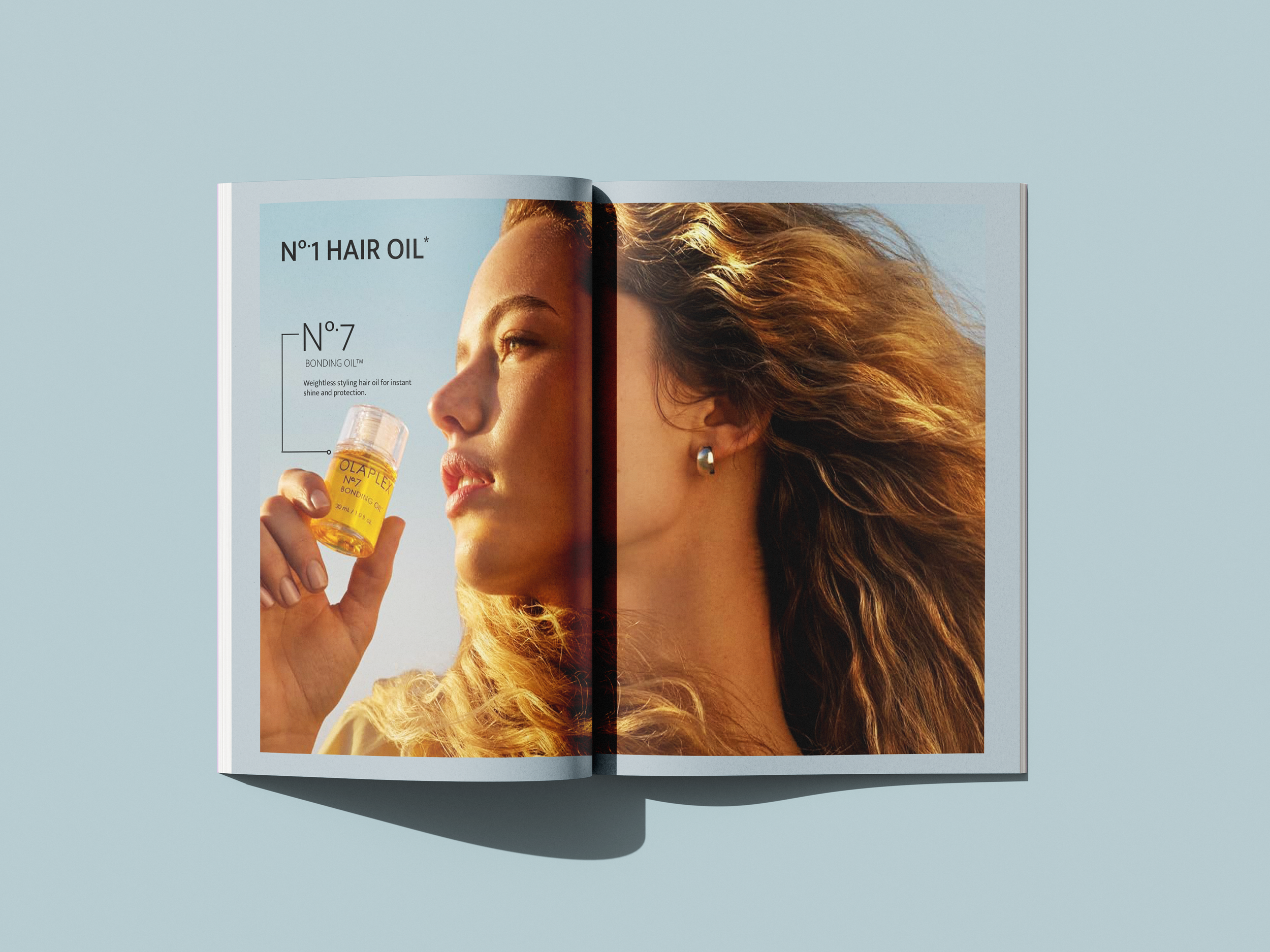
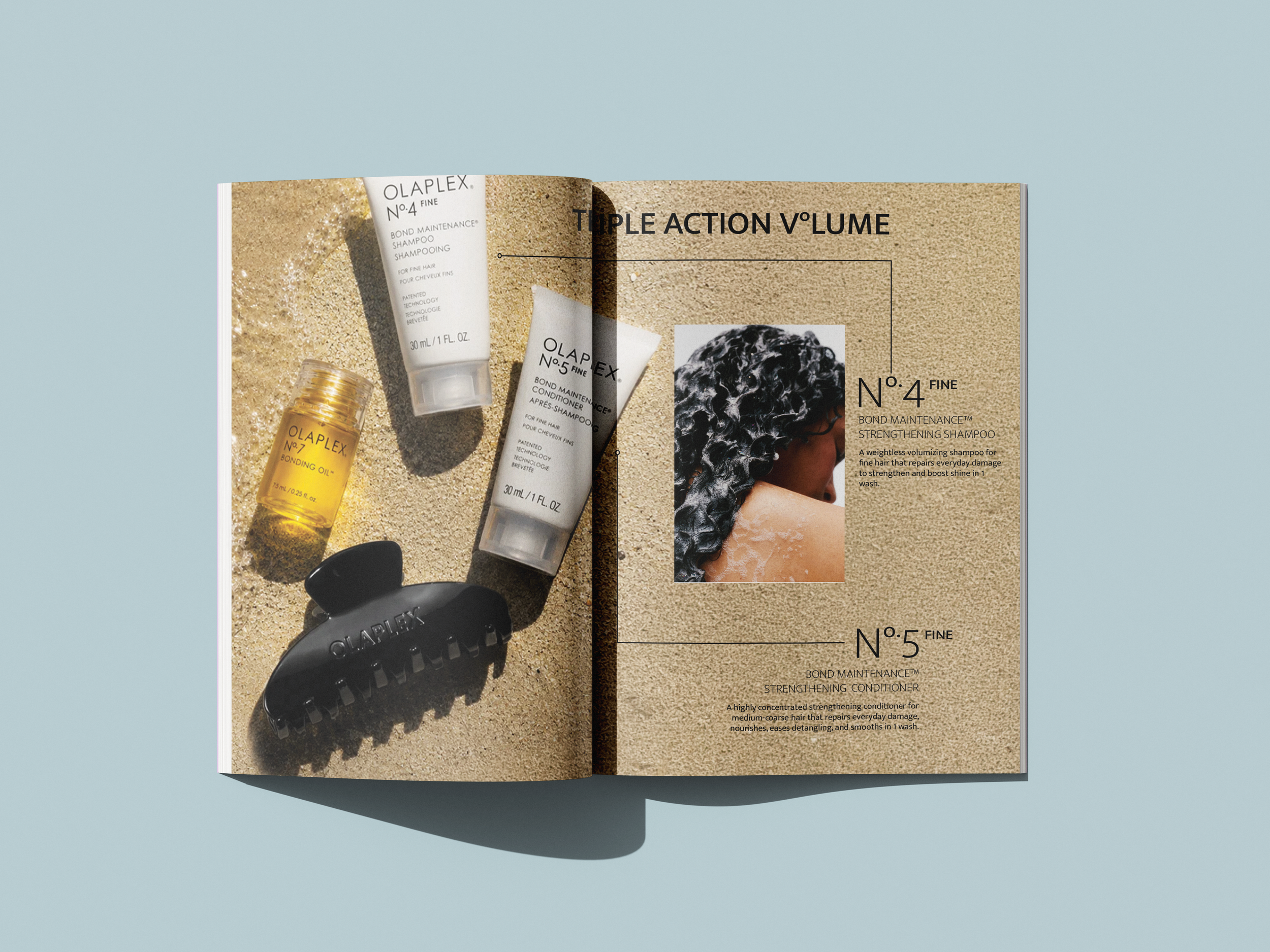
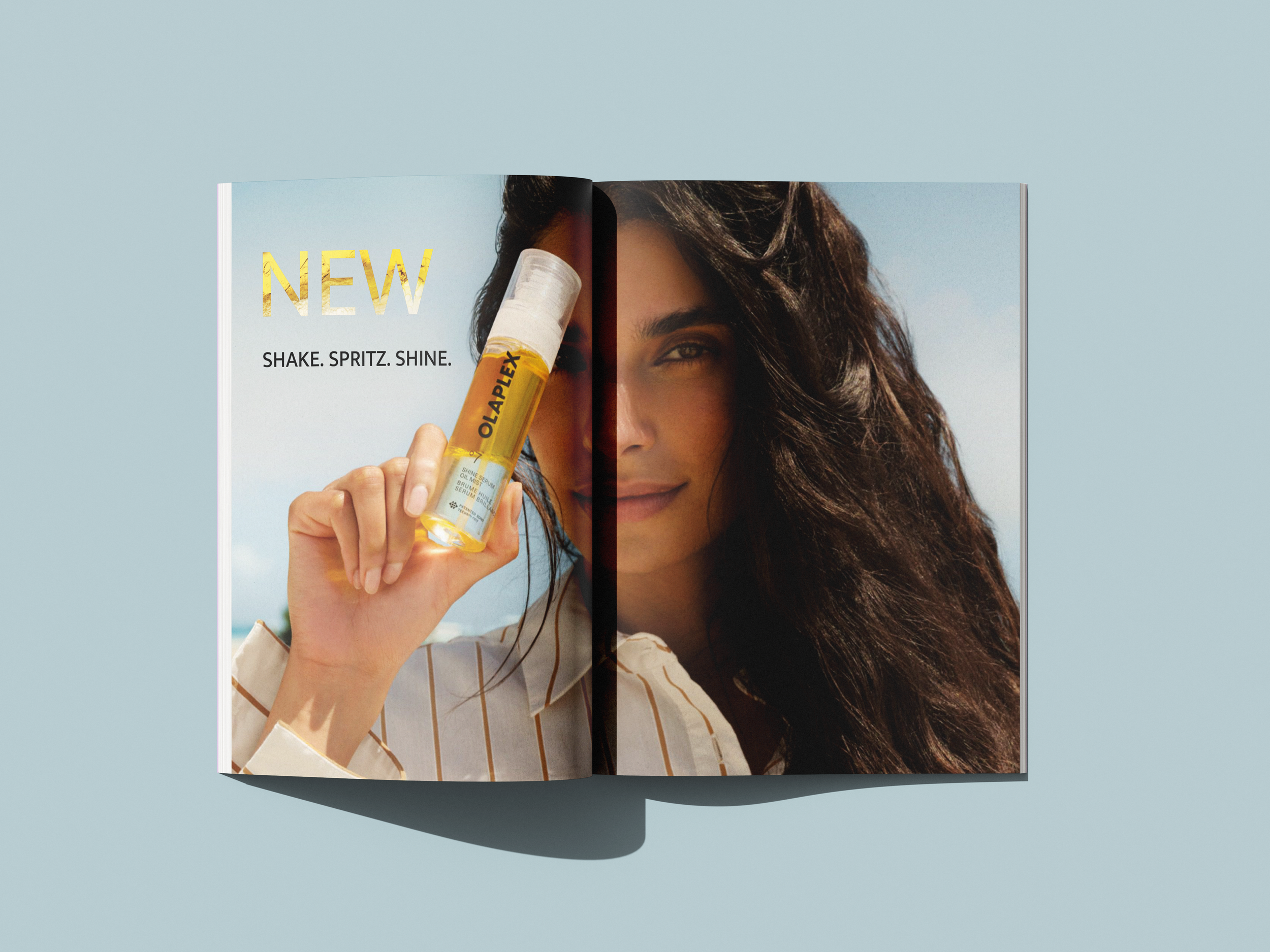
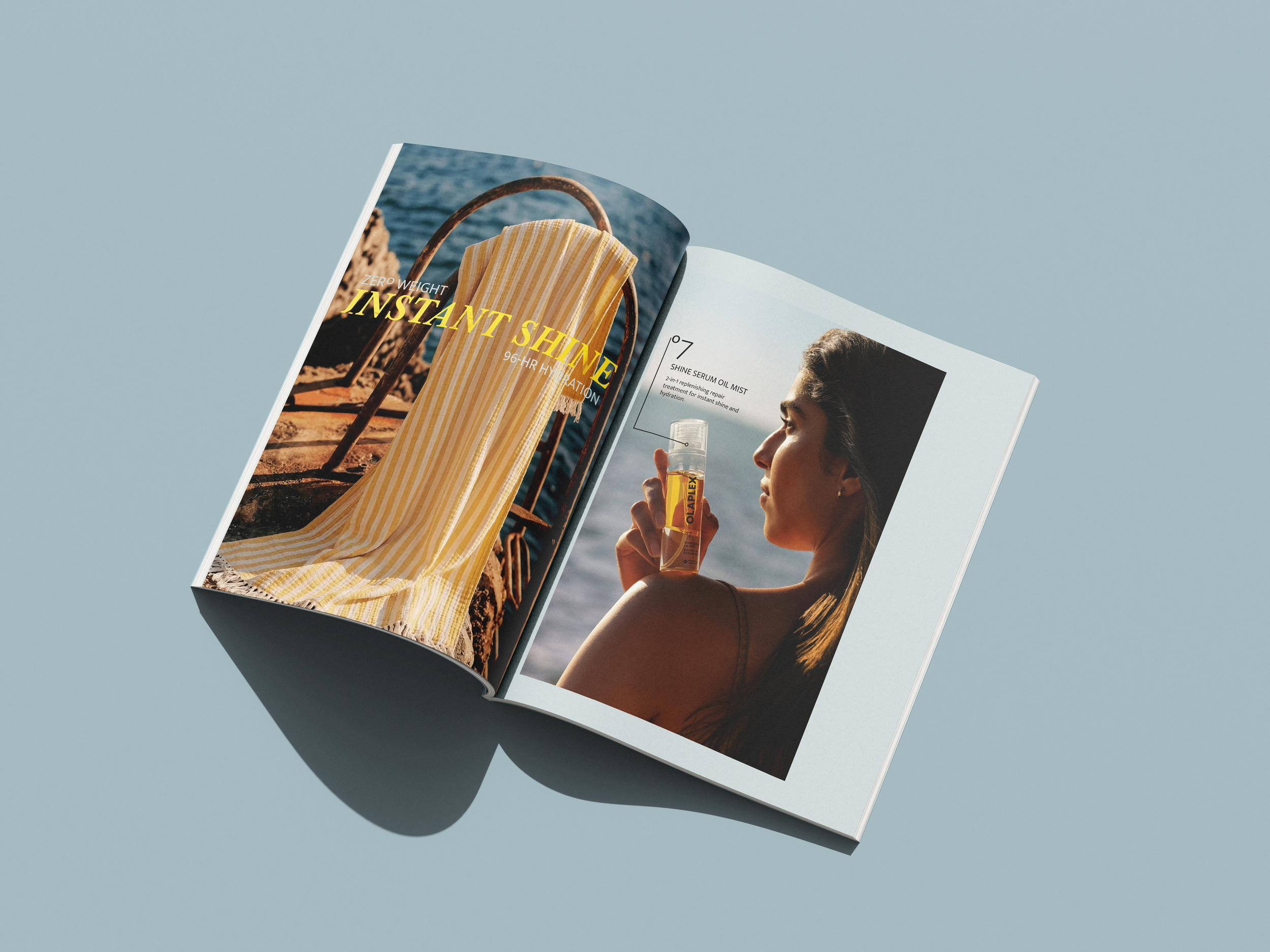
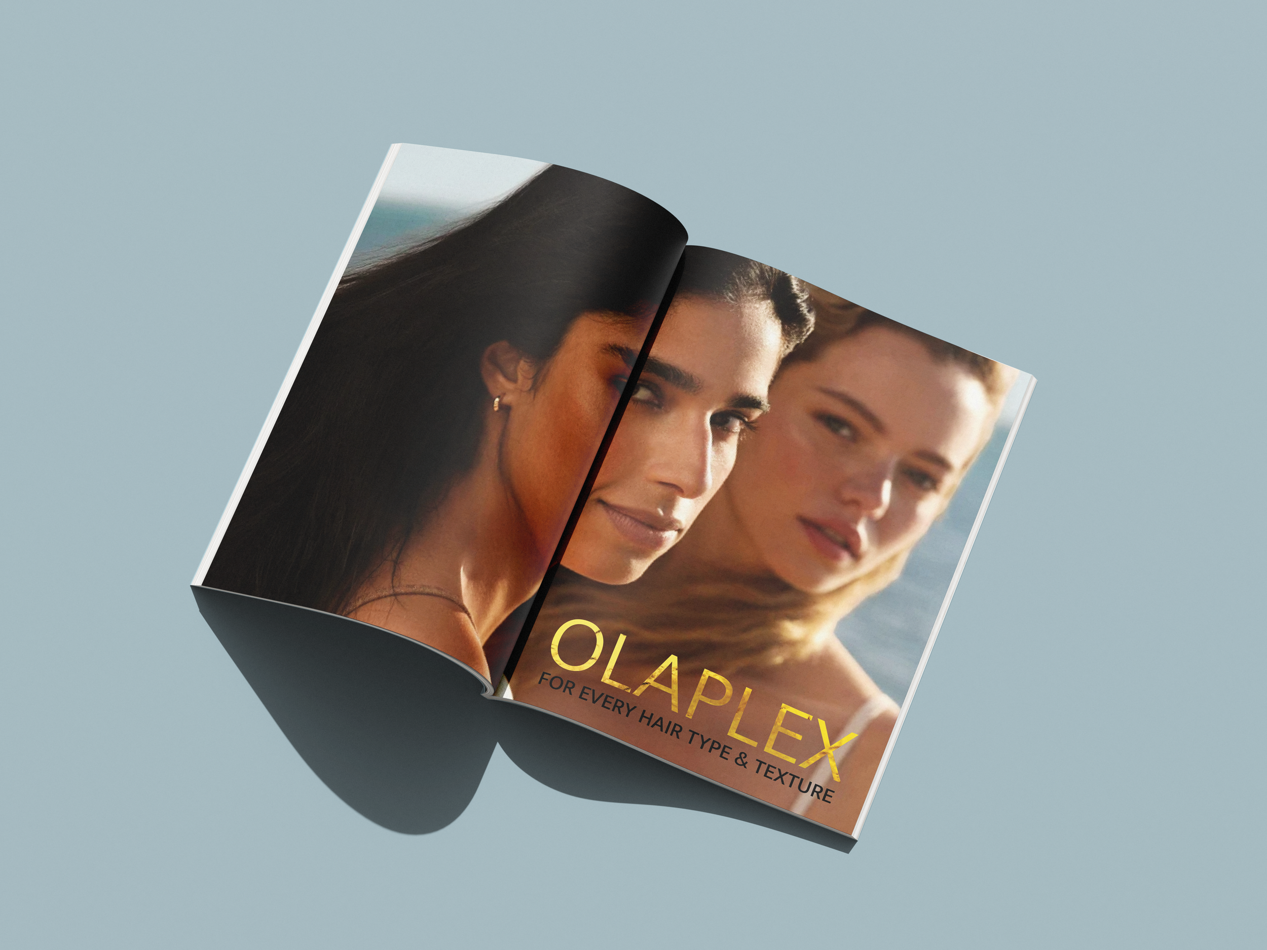
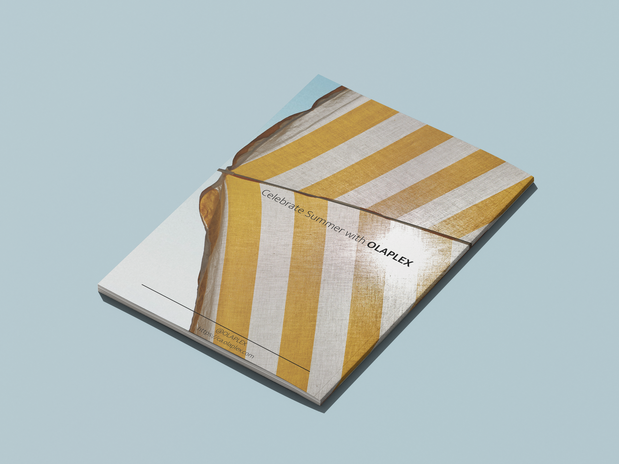
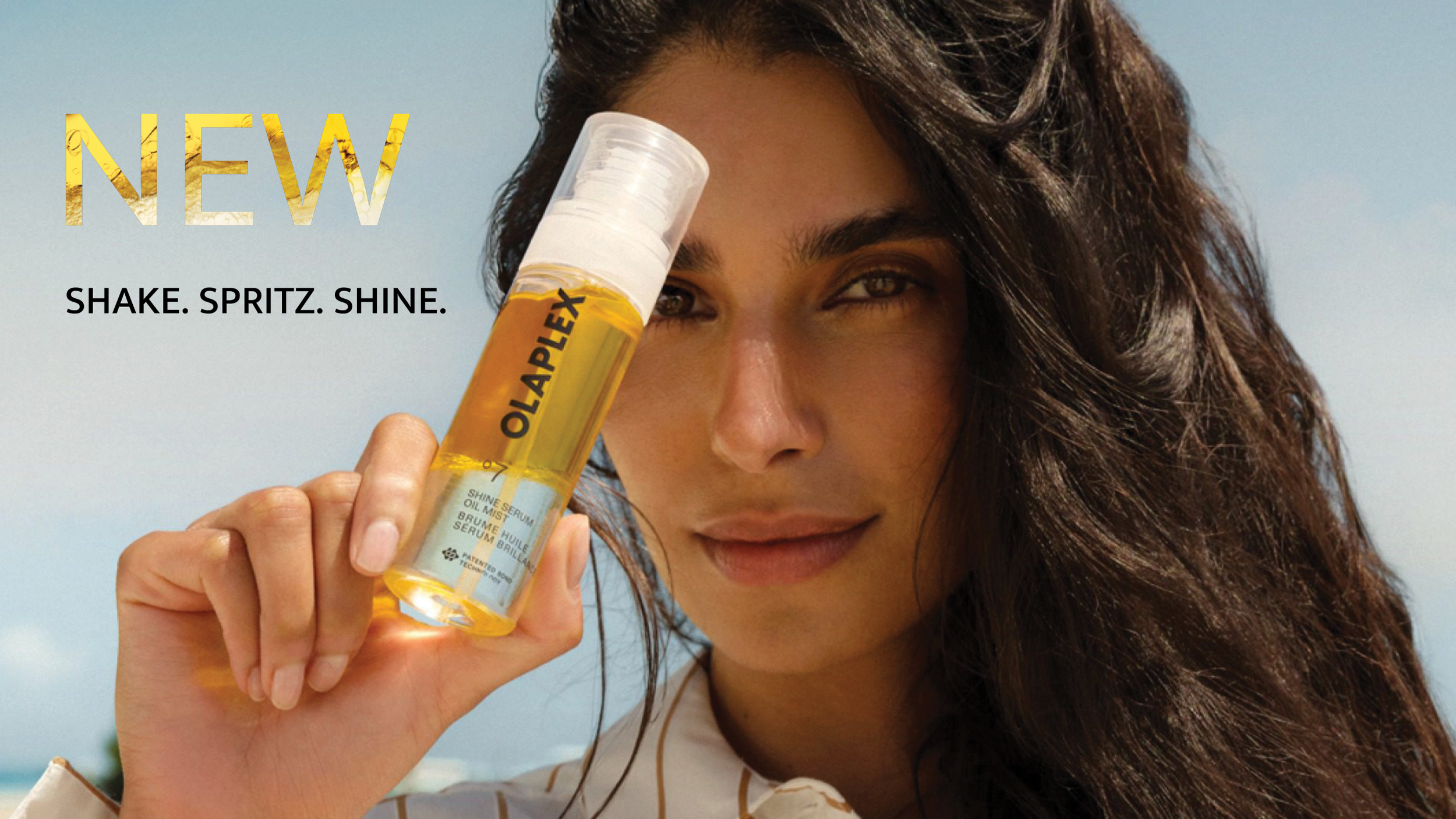
Celebrate Summer is a brochure concept for OLAPLEX that translates the brand’s refined visual language into a more playful, summer-driven editorial experience. The creative direction balances flirtatious energy with restraint, using a palette of yellow, blue, black, white, and beige to introduce warmth and vibrancy without moving outside the established brand world. Yellow becomes a key visual cue throughout the piece, referencing the golden tones of OLAPLEX’s signature oils while creating a clear focal point around the new oil mist.
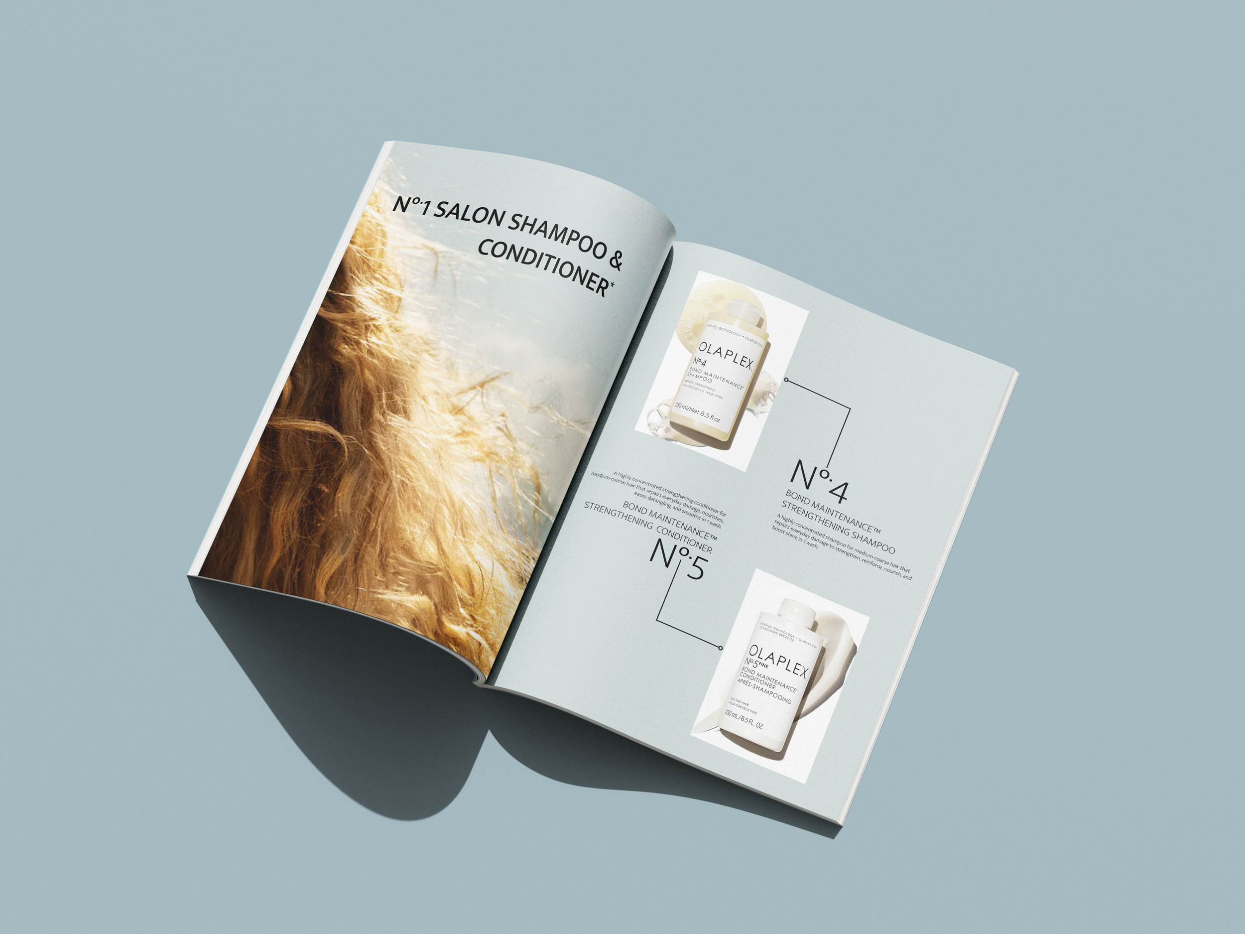
The visual system builds on existing OLAPLEX brand codes through minimal typography, controlled hierarchy, structured image framing, and generous use of space. Rectangular compositions and fine directional lines create rhythm across the brochure, while circular details subtly reference the “O” within OLAPLEX’s Nº product system. The result is a graphic language that feels recognizably OLAPLEX while giving the campaign its own distinct point of view.
Brand photography was paired with select imagery from Unsplash and art directed through consistent Photoshop treatment to create a cohesive visual world. Product descriptions were sourced from the OLAPLEX website, allowing the concept, layout, and visual storytelling to remain grounded in the brand’s existing product language.