Calgary Stampede
A Vintage-Inspired Spec Poster
Role: Art Direction • Illustration • Poster Design
Independently executed.
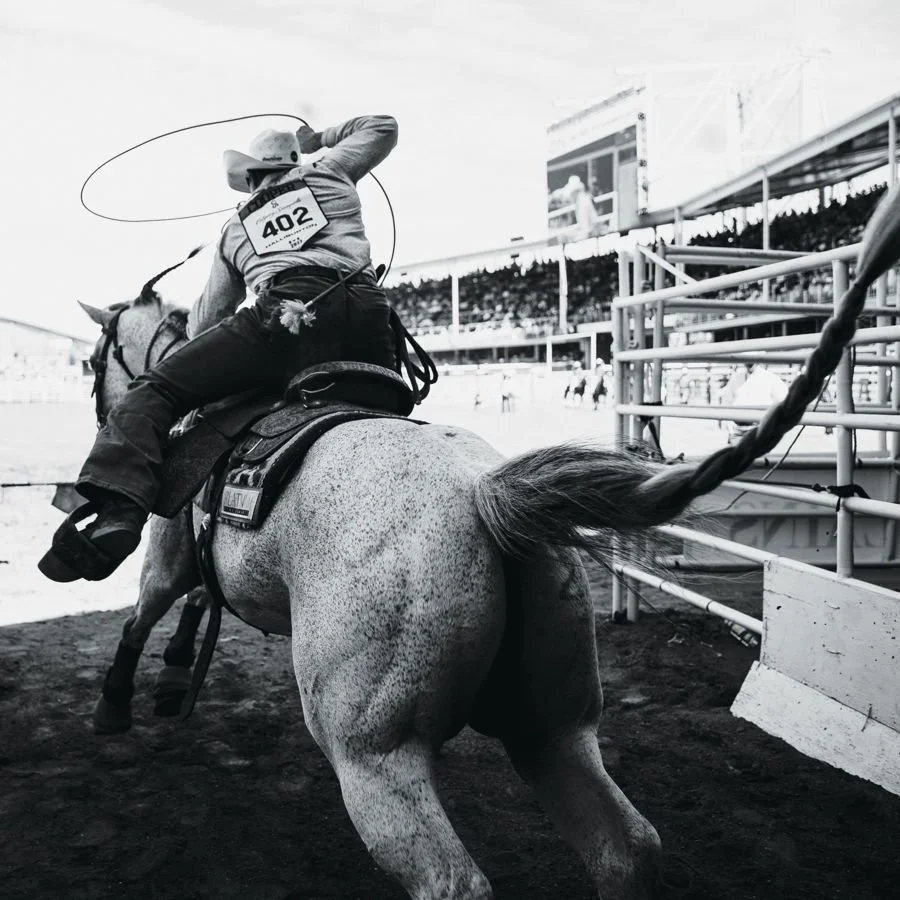
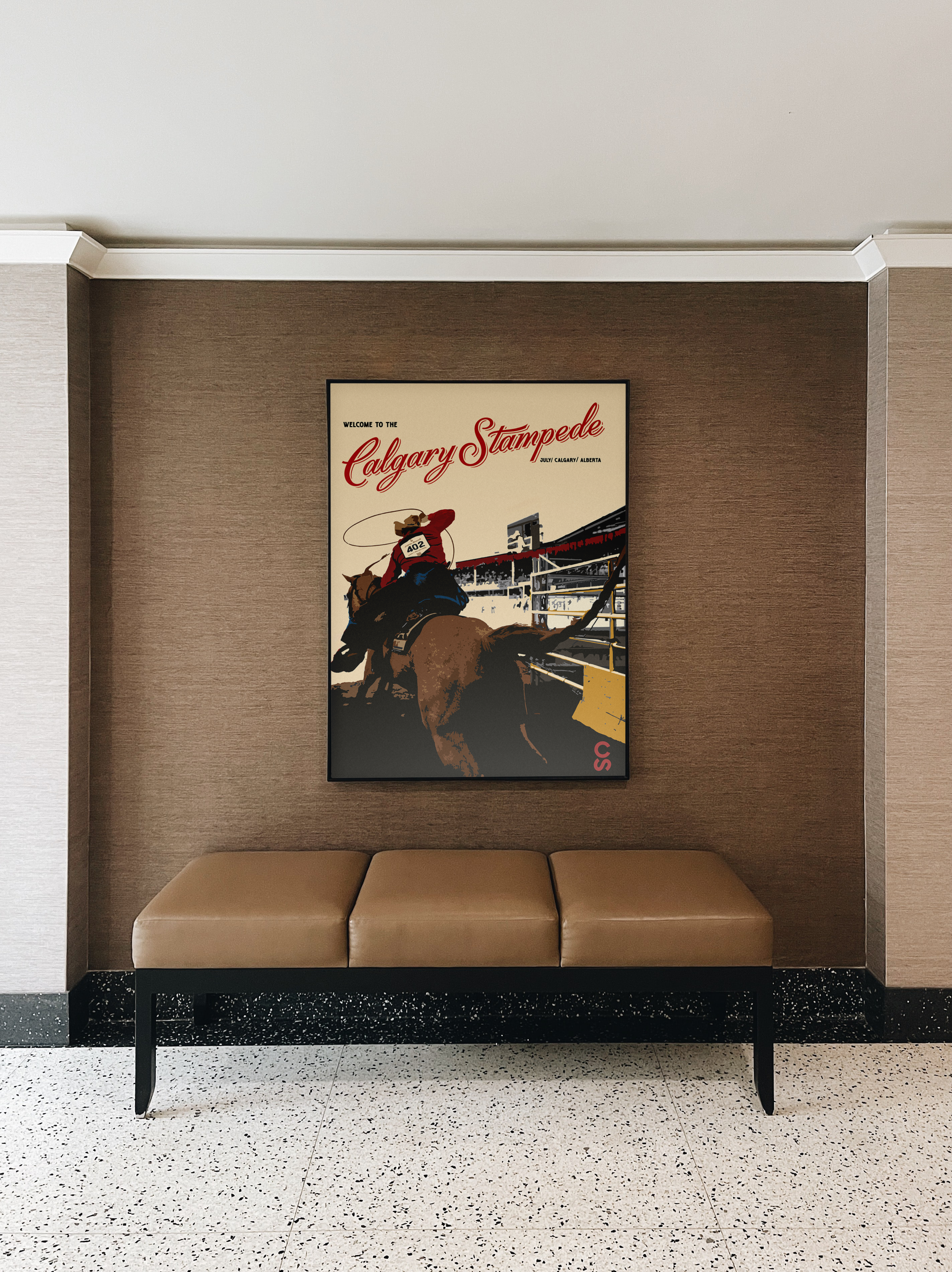
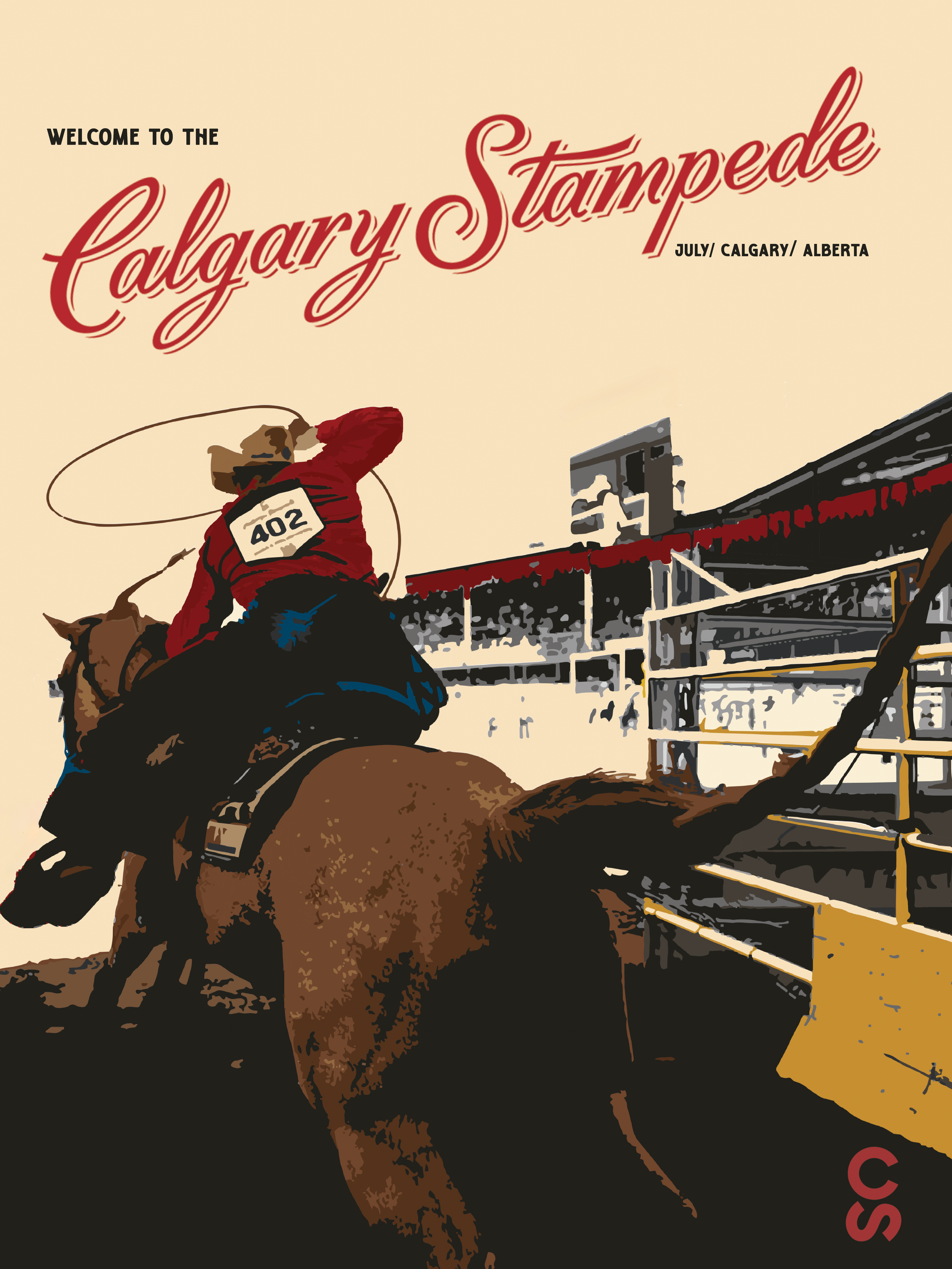
Welcome to the Calgary Stampede is a vintage-inspired spec poster that reimagines the event through the visual language of mid-century western and travel advertising. I began with a 1970s rodeo photograph and used its perspective as the foundation for the composition, placing the viewer inside the arena behind the rider to create a more immersive, experiential point of view.
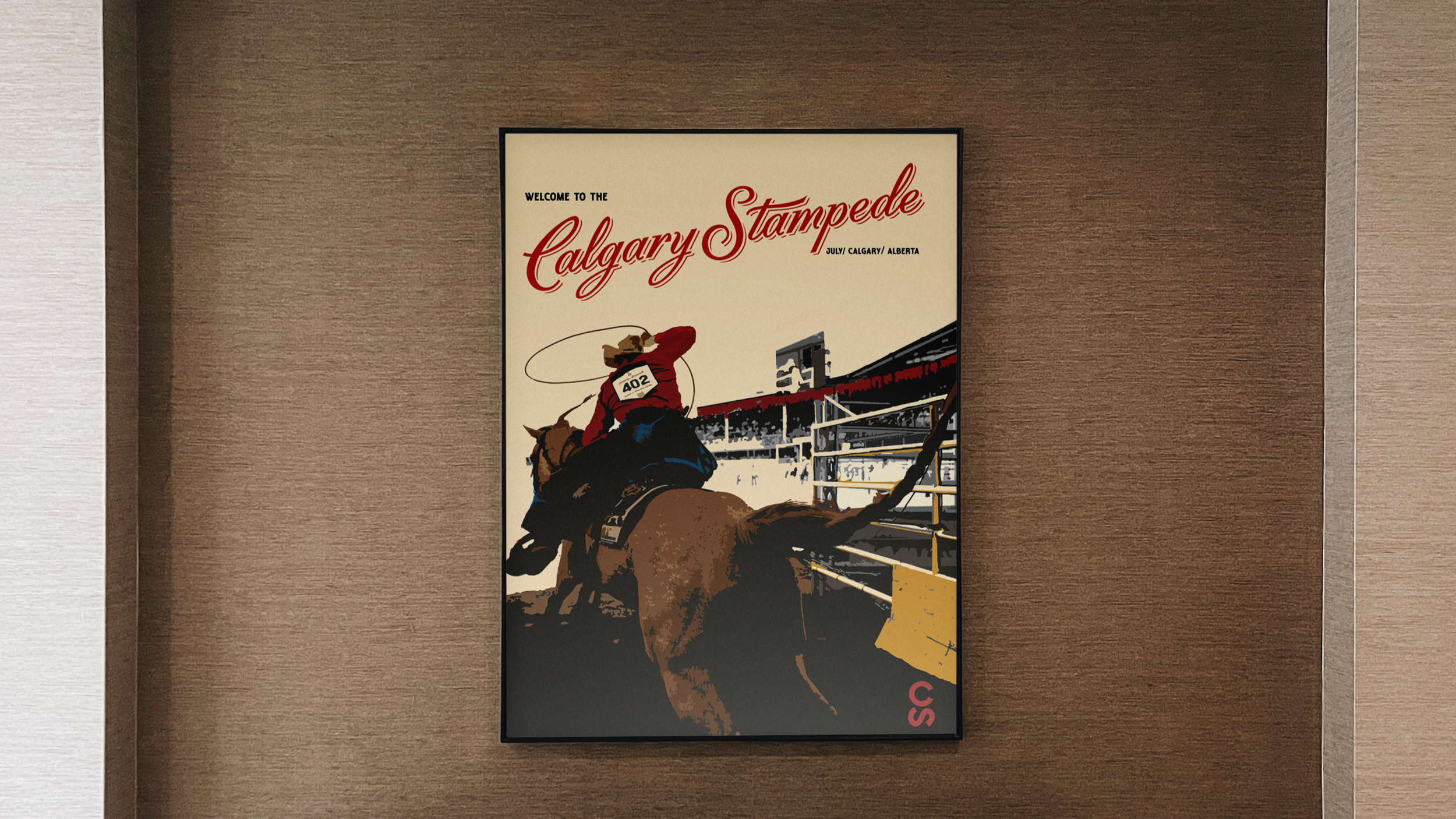
The art direction draws from the heritage and visual identity of the Stampede through a combination of vintage western typography, the event’s iconic script logo, and a warm, limited colour palette of deep red, beige, brown, charcoal, grey, and muted yellow. Together, these elements evoke the dust, energy, tradition, and nostalgia associated with the event.
Typography was kept intentionally minimal so the illustration could remain the focal point. By translating the original photograph into a simplified, limited-colour graphic treatment, the poster shifts from documentary image to destination piece—celebrating the Calgary Stampede as both a cultural event and an enduring symbol of western identity.